Categories
Uncategorized

Reviewing Design Systems

The old saying “communication is key” becomes even more relevant when working with a team on a design system. Along with the new hurdle of limited in-person contact, creating a design system with clear naming conventions and consistent components proved to be difficult at first. However, over time it gradually became easier as routines began to form and the pattern library was created.

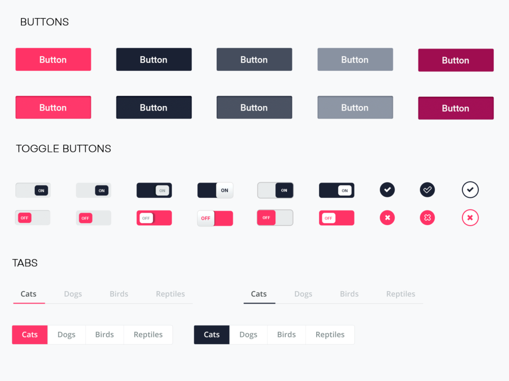
Here’s a piece of our pattern library that we created. We utilized CSS classes, id tags, and other elements to develop a useful tool that helped us recreate common components in our webpages. Similarly to symbols in Sketch and Figma, we were able to copy pieces from our pattern library and paste them in their designated location on the page.

In the beginning

At first, it was a challenge to delegate certain tasks to each group member. We decided that one person would work on the pattern library and the other two would start to develop the HTML content for the webpages. When it came to larger tasks like establishing the navigation bar, we met on a Zoom call and worked on it together. We found it easiest if one person shared their screen and the other two helped when needed. While our coding skills are relatively close, we worked faster as a team when we put our three heads together.

GitHub

In order for all team members to work on the code together, we needed a way to share our HTML, CSS, JavaScript and images. GitHub is a collaborating coding tool that allows for multiple branches, pull requests, and other functions that make our lives easier. The software itself is very helpful, but it was a bit confusing at first.

One function that was confusing at first was branches. We originally made our HTML and CSS pages in the main branch, then we made two separate branches for Marketing and Web-app. Separating the branches is nice for adding new features and working on pages before merging them into the final main branch. Personally, I didn’t understand these benefits until we later merged them together. One mistake we made was accidentally working on the main branch rather than the separate ones.

Coding Habits

Another challenge I faced personally was adjusting my coding habits and learning those of others.

In some ways, it was helpful to learn good practices from my teammates. We helped each other when we were stuck, so it was nice to have a team you can depend on. However, there were some class names that we agreed on that are different from what I’m used to. It took some getting used to, but in the end it paid off.

Conclusion

Overall, this was very beneficial to create and code a design system with other people. There were ups and downs along the way, but the final result was worth it. As for design systems, I still believe they are the most practical method for creating a consistent product. I will continue using them in my future work for all types of projects.

Categories
Uncategorized

Design Systems: Where to Begin

When creating a design system, finding the best practice that suits your style and needs is most important. There are many ways to go about it, but you must find the strategy that is best for you. As Brad Frost noted in Episode 3 of InVision’s DSM Expert Advice series, the user does not care how any of the content was created. They only care about the final product. As long as the finished interface is functional, consistent, and useful, the choices made in creating a design system are totally up to the designer and what’s best for them.

The same principles apply when working as part of a design team. Your combined goals should drive your decisions in determining the best method of creating a design system. Every team member must be on the same page in order for the approach to be effective.

Testing a Pilot

Before investing hours of work into building a design system, it is recommended to start with a pilot. Like the first episode of a new television series, a pilot is a test to make sure the system will actually be useful later on.

A pilot is a collection of basic components that will be used in the system. Once you have these all laid out, you can begin to “grade” the usefulness based on several different categories. These criteria cover a wide range of topics and ultimately will help you determine whether to continue on the same path or take another direction.

My Strategy

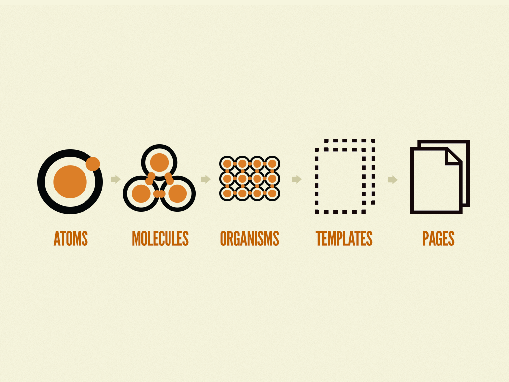
With the little experience I have working with design systems, it is apparent to me how important communication is with other team members. Having a clear understanding of how atomic design works and the five different tiers of components is mandatory in order for progress to be made. All team members should know when and how to use atoms, molecules, organisms, templates, and pages.

Atoms are the smallest pieces of a design system. They cannot be broken down anymore while still being considered useful. Atoms include things like labels, buttons and form inputs. They are not necessarily useful alone, but when combined they begin to provide meaning. Because there are so many atoms, organizing them in the beginning will save you so much time later on. Sorting atoms into categories and properly naming them with the same conventions as other team members is something I will always practice in my work.

The next step is combining atoms to create molecules. A molecule might consist of two or three atoms combined in a small section.

Now, suddenly, these atoms have meaning. They have utility.

For example, a label, form input, and button might combine to make a search query. Within my team, we will determine what is considered an atom vs a molecule. Is light text inside a form input box necessary for what the project requires? These are things we need to work out as a team before going any further.

Next, organisms start to group content in a more complex way. These are like molecules but with more components and even more uses. One of the most recognizable organisms is the navigation bar. A combination of atoms and molecules form to produce a valuable part of the webpage. We also must determine, as a group, how overrides affect the color of when a page is selected vs. when it’s not.

The fourth category with a system is a template. These help us see the UI as a cohesive whole rather than a bunch of independent parts. The specific content is not as important in templates. We are simply laying out the outline and sorting out these patterns for different pages.

Lastly, pages are the final product that our users will actually interact with. Therefore, it is crucial we make this like a real representation of the finished interface. It is here we see all other components together to create a finished product.

While there are many things to remember when creating a design system, you are never wrong if your approach works for you and your team. Design systems are a great way to establish a set of components in a way that is consistent to your entire organization.

Categories
Uncategorized

Design Systems

Josh Clark describes “the heartache of design at scale” as the challenge that large organizations face when working on bigger projects or products. He relates how the complexity of design has become just as intricate as the company itself.

Design systems are meant to simplify the design process by maintaining consistency when creating a website or interface.

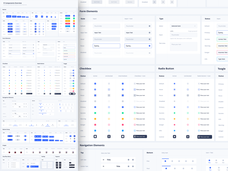
A glimpse at an existing design system.

In episode 1 of InVision’s DSM Expert Advice series, Brad Frost lists the benefits of design systems. These advantages include UI consistency, faster production, higher quality, shared vocabulary, easier to test, useful reference, and future-friendly. Frost, Clark, and Dan Mall stress the importance of design systems in large-scale projects, but I believe they are useful no matter the size or complexity of the task. Although it may seem like a lot of work, it will produce higher quality results in the end. Also, if the project was originally intended to be small and gradually grows into something bigger, establishing a design system early will save you the hassle of having to go back and restart later on.

“…one hand doesn’t know what the other hand is doing, even when they’re both my hands. Imagine what happens when you multiply that times many people, times many projects, times many teams, times many years.”

As the project grows and people begin using the website/interface more, failing to utilize a system will only create confusion and an inconsistent feel.

As Frost noted, the design system includes, but is not limited to, design principles, design tokens, UX guidelines, UI patterns and templates and flows. This is not, however, the same thing as a UI kit. While a UI kit may be part of the system, it is much more than that. UI kits are created only for the designer, but a design system can be used by all members of the team.

While a UI kit is useful to designers, a design system can be used by the entire team.

My past experience with UI kits has been very beneficial to my needs as a designer. They save me time by reusing existing patterns without having to reinvent the wheel. UI kits are only a start to a design system, which is a much more complete resource for an entire organization.

Frost also talks about something called an interface inventory. This is an evaluation of an organization’s entire collection of UI patterns with the goal of determining a design system’s makeup and roadmap. In order for the interface inventory to be successful, everyone must combine their efforts for the cause. Designers, developers, etc. must express their concerns and evaluate what’s working and what’s not.

The second step is to create a slideshow of screenshots containing the design system in action. Next, you need to work together to chunk parts into corresponding categories. These different categories might include headers, footers, and buttons. Then, you must create a consistent language that everyone will understand when talking about a certain part of the system. Lastly, the team will combine their findings and make a master document consisting of all parts of the design system. From here, you can determine its usefulness and develop a strategy moving forward.

In conclusion, I believe using design systems would be very useful. Working as an in-house designer with a strong design system in place will make your future work much easier and better quality, as well.