Josh Clark describes “the heartache of design at scale” as the challenge that large organizations face when working on bigger projects or products. He relates how the complexity of design has become just as intricate as the company itself.
Design systems are meant to simplify the design process by maintaining consistency when creating a website or interface.

In episode 1 of InVision’s DSM Expert Advice series, Brad Frost lists the benefits of design systems. These advantages include UI consistency, faster production, higher quality, shared vocabulary, easier to test, useful reference, and future-friendly. Frost, Clark, and Dan Mall stress the importance of design systems in large-scale projects, but I believe they are useful no matter the size or complexity of the task. Although it may seem like a lot of work, it will produce higher quality results in the end. Also, if the project was originally intended to be small and gradually grows into something bigger, establishing a design system early will save you the hassle of having to go back and restart later on.
“…one hand doesn’t know what the other hand is doing, even when they’re both my hands. Imagine what happens when you multiply that times many people, times many projects, times many teams, times many years.”
As the project grows and people begin using the website/interface more, failing to utilize a system will only create confusion and an inconsistent feel.
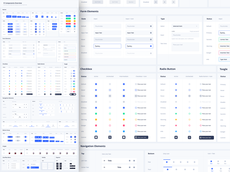
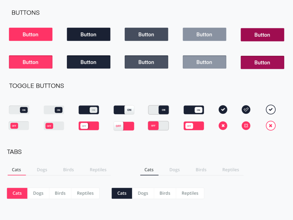
As Frost noted, the design system includes, but is not limited to, design principles, design tokens, UX guidelines, UI patterns and templates and flows. This is not, however, the same thing as a UI kit. While a UI kit may be part of the system, it is much more than that. UI kits are created only for the designer, but a design system can be used by all members of the team.

My past experience with UI kits has been very beneficial to my needs as a designer. They save me time by reusing existing patterns without having to reinvent the wheel. UI kits are only a start to a design system, which is a much more complete resource for an entire organization.
Frost also talks about something called an interface inventory. This is an evaluation of an organization’s entire collection of UI patterns with the goal of determining a design system’s makeup and roadmap. In order for the interface inventory to be successful, everyone must combine their efforts for the cause. Designers, developers, etc. must express their concerns and evaluate what’s working and what’s not.
The second step is to create a slideshow of screenshots containing the design system in action. Next, you need to work together to chunk parts into corresponding categories. These different categories might include headers, footers, and buttons. Then, you must create a consistent language that everyone will understand when talking about a certain part of the system. Lastly, the team will combine their findings and make a master document consisting of all parts of the design system. From here, you can determine its usefulness and develop a strategy moving forward.
In conclusion, I believe using design systems would be very useful. Working as an in-house designer with a strong design system in place will make your future work much easier and better quality, as well.
