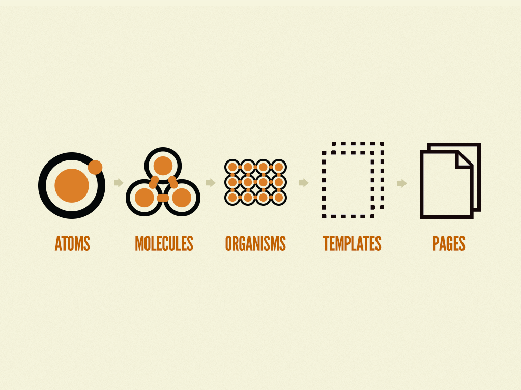
When creating a design system, finding the best practice that suits your style and needs is most important. There are many ways to go about it, but you must find the strategy that is best for you. As Brad Frost noted in Episode 3 of InVision’s DSM Expert Advice series, the user does not care how any of the content was created. They only care about the final product. As long as the finished interface is functional, consistent, and useful, the choices made in creating a design system are totally up to the designer and what’s best for them.
The same principles apply when working as part of a design team. Your combined goals should drive your decisions in determining the best method of creating a design system. Every team member must be on the same page in order for the approach to be effective.
Testing a Pilot
Before investing hours of work into building a design system, it is recommended to start with a pilot. Like the first episode of a new television series, a pilot is a test to make sure the system will actually be useful later on.

A pilot is a collection of basic components that will be used in the system. Once you have these all laid out, you can begin to “grade” the usefulness based on several different categories. These criteria cover a wide range of topics and ultimately will help you determine whether to continue on the same path or take another direction.
My Strategy
With the little experience I have working with design systems, it is apparent to me how important communication is with other team members. Having a clear understanding of how atomic design works and the five different tiers of components is mandatory in order for progress to be made. All team members should know when and how to use atoms, molecules, organisms, templates, and pages.

Atoms are the smallest pieces of a design system. They cannot be broken down anymore while still being considered useful. Atoms include things like labels, buttons and form inputs. They are not necessarily useful alone, but when combined they begin to provide meaning. Because there are so many atoms, organizing them in the beginning will save you so much time later on. Sorting atoms into categories and properly naming them with the same conventions as other team members is something I will always practice in my work.
The next step is combining atoms to create molecules. A molecule might consist of two or three atoms combined in a small section.
Now, suddenly, these atoms have meaning. They have utility.
For example, a label, form input, and button might combine to make a search query. Within my team, we will determine what is considered an atom vs a molecule. Is light text inside a form input box necessary for what the project requires? These are things we need to work out as a team before going any further.

Next, organisms start to group content in a more complex way. These are like molecules but with more components and even more uses. One of the most recognizable organisms is the navigation bar. A combination of atoms and molecules form to produce a valuable part of the webpage. We also must determine, as a group, how overrides affect the color of when a page is selected vs. when it’s not.
The fourth category with a system is a template. These help us see the UI as a cohesive whole rather than a bunch of independent parts. The specific content is not as important in templates. We are simply laying out the outline and sorting out these patterns for different pages.
Lastly, pages are the final product that our users will actually interact with. Therefore, it is crucial we make this like a real representation of the finished interface. It is here we see all other components together to create a finished product.
While there are many things to remember when creating a design system, you are never wrong if your approach works for you and your team. Design systems are a great way to establish a set of components in a way that is consistent to your entire organization.
