Overview
Mercy Care is a free medical clinic for uninsured individuals currently living in Muskegon, Michigan. The brand visuals emulate the values, which are equality and fairness for all patients while exhibiting a freindly, welcoming impression.

According to the Michigan Department of Community Health, of the 146,736 adult residents in Muskegon, 20,775 of them are uninsured.
These low-income individuals are ineligible for health insurance due to several reasons: they do not have access to coverage through their job, high costs, or they do not know how to get help. To better understand how patients would interact with the process, I sketched out a story map.
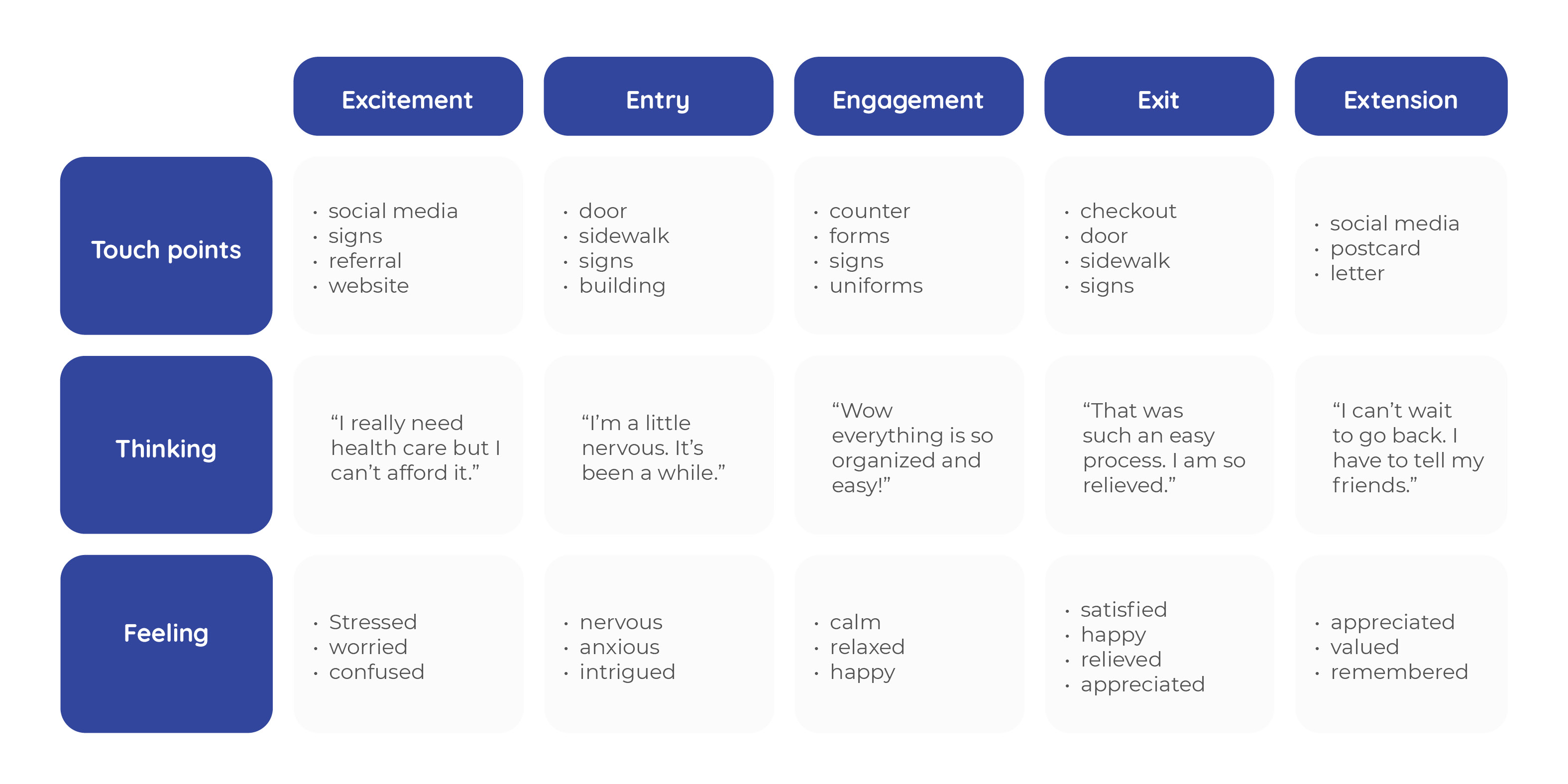
The process itself of applying for health care is stressful. Pateints must go through a long, extensive list of tasks to ultimately get the help they need. To counter the anxiety and stress that is put on the users, I developed a series of values to better alleviate the onboarding process.
Values
Creating a sense of warmth and belonging, where everyone is welcome

Treating patients with respect, equality, and fairness

Excellence and innovation in medical care practices

Clear communication and easy, friendly experience for each individual

Passion and commitment to each and every patient

Value Proposition
For uninsured and low-income adults in Muskegon, Mercy Care provides free medical services in friendly, convenient manner.
When developing a brandmark, I wanted to convey the sense of duality to show Mercy Care is accepting of all people. Everyone should feel equal and no one person is more important than the next. Their should be a warm, welcoming feeling to the brand, as well.
Patients interact with the brand in several ways. To get a better understanding of potential touchpoints, I utilized this chart.
BR Fitness sitemap
Employee Uniforms & Apparel
Scrubs
Doctors and nurses wear scrubs with follow brand colors and show logotypes
Mask
Volunteers, receptionist, social workers, etc. wear a branded cloth facial mask at all time.
Name Tag
Doctors, nurses, volunteers and all other employees wear name tags at all times.
Signage
Signage on the building reflects the brand and values. The welcoming typeface and calm colors, as well as the logo representing two people holding hands, hints at what you can expect inside.
Stationery & Appointment Reminder
Website
The website is set up to give the user a simple, yet meaningful experience. Design choices include clear and easy-to-read typefaces and contrast in size and colors throughout.