
Ferris Outfitters is a unique experience for students at Ferris State university offering a one-stop shop for spirit gear, school supplies, snacks, and student services. Previously known as the Ferris State university Bookstore, Ferris Outfitters's new brand identity is spirited, student-centered, and trendy.
| Date | Field |
|---|---|
| Fall 2021 – Spring 2022 | Branding, Environmental Design |
| Type | Client |
| Team Project | Ferris Outfitters (Auxiliary Enterprises) |
I focused mainly on developing the type system, environmental design, and vendor relations for this project. The four-member group worked together to create concept presentations, establish a design brief, initiate production, and ultimately design a beautiful new brand identity and brand manual.
To be the most distinctive and memorable campus store that provides a valuable experience to students, faculty, and alumni of Ferris State university.
Ferris Outfitters is the only one-stop-shop on campus that provides customers with products and services all in one convenient location.
Through research and initial client discussions, we categorized a vast group of users into 3 main groups: Students, alumni, and locals. We focused on these three users when creating the brand and overall experience.


In order to establish an attitude for the store, we asked our client to participate in a brand workshop activity. We listed out different adjectives on a spectrum and asked them to estimate where the brand stands. The results jump-started our ideas for brand visuals, as well as settled on values and tone of voice.
We asked our client to think, "How will we describe ourselves?" Here is how our client positioned themselves on the scale:

Next, we asked our client to think, "How will we sound?"

Based on the exercise, we found the brand core values to be progressiveness, personalization, loyalty, convenience, and intuitiveness.
As for tone & manner, we landed on the following descriptive words: bold, inclusive, informative, enthusiastic, and bright
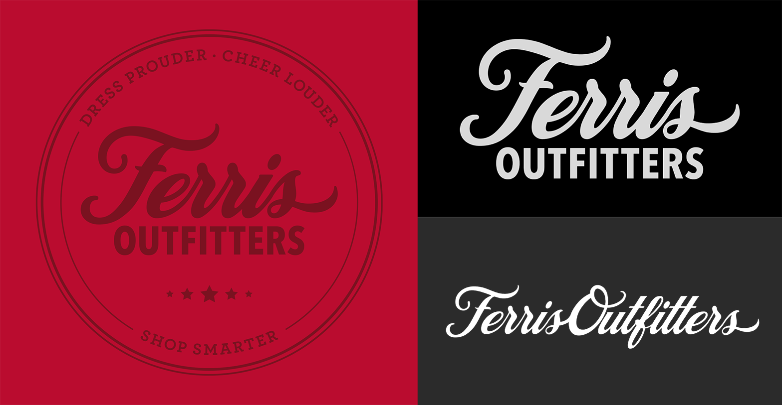
As we began to think about the brand visuals more, we had to consider the location of the store. Ferris Outfitters is in the University Center at the center of campus. We decided it would be inappropriate to stray too far away from Ferris State’s color scheme. So, we considered our options and decided on a complimentary color palette that branches off of Ferris’s primary colors.

Looking back at the values we originally established, typography was designed to exude similar feelings. We wanted it to look bold and bright while also being accessible and legible. We also worked with a copywriter to come up with a strategy for headlines.

Using the typefaces above, we created a strategy for headlines using a combination of text and typographic styling devices. The lines help create a finished appearance and the stars hint at school spirit.

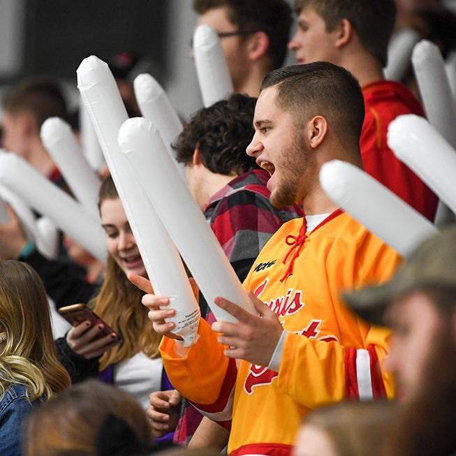
The photography style is intended to be fun and engaging. We worked with a student photographer who did an excellent job illuminating the cheerful nature of the brand.

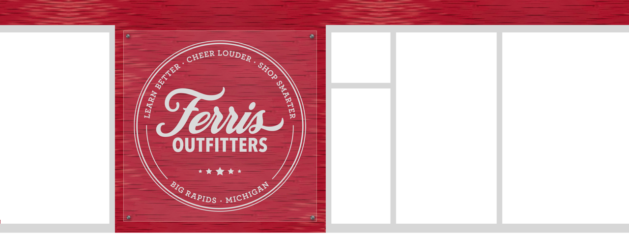
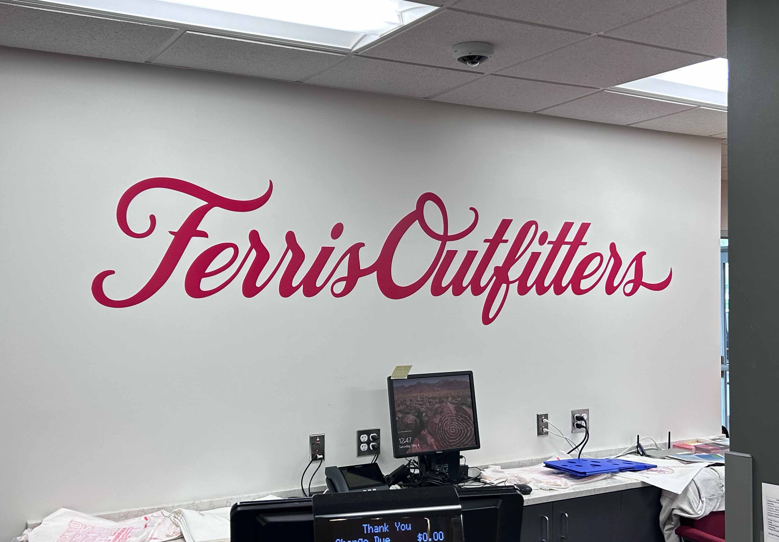
The original store sign sat atop the doorway of the main store entrance, but had very limited space. As a solution, we decided on a clear acrylic sign on the large open wall. This results in a much better use of space and more attractive signage.
Since the store is located inside a multipurpose building, Ferris Outfitters also needed signage on the outside of the University Center.

Other signage around the store utilizes a combination of photography, color, and type to intrigue our users and invite them into the store.


Similarly, we created a system for different types of marketing materials. These easy-to-use templates help maintain consistency for those in charge of designing them.

We distributed our branding and emblem mark on other touch points, like an employee shirt, shopping bag, and subscription box.


We left our client with this brand manual. It detailed brand values & vision, how to use the logos, color, & typography, as well as the Bulldog Service Center brand system. Click here to view the full book.

Since this project only lasted a school year, some of our designs were not implemented until after graduation. However, our brand book and on-going conversations with vendors made the transition easy for the team to begin production.
Here are some of the items produced after our semester wrapped up:


Awarded by the American Advertising Federation District 6 judges, as part of a virtual competition receiving entries from Illinois, Indiana and Michigan.
This qualifies our work for consideration at the AAF National Awards Competition.

