
Southwest Airlines is trying to improve their boarding process by looking at the overall experience for a user. My goal was to examine the pain points in the current process, innovate and create a more efficient strategy, and test these ideas on potential users.
| Date | Field |
|---|---|
| Spring 2021 | UI/UX Design, Print |
| Type | Client |
| Individual project | Ferris State University project |

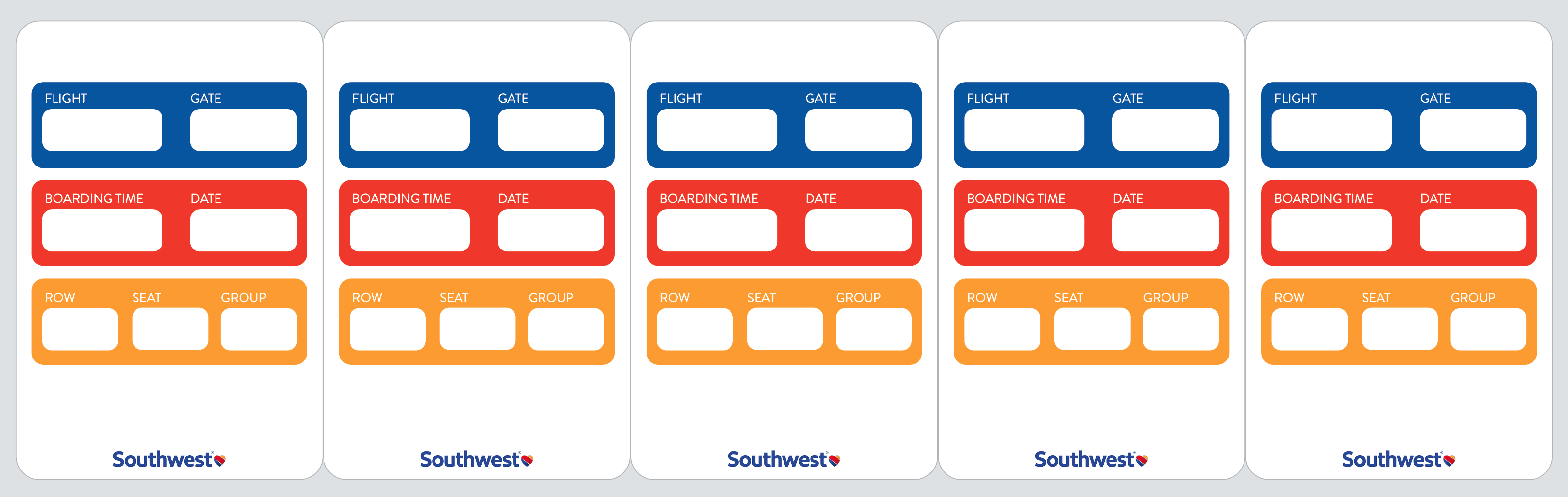
There is currently information on a boarding pass that users do not need, which leads to a cluttered ticket. The information should be organized to allow for users to quickly find what they’re looking for.
My proposed idea is a sticker consisting of all the information a passenger and employee needs. This sticker can be placed on the back of a phone, on a luggage tag, or any other item a user wants to place it on.


For the passenger, the sticker will eliminate the need for a separate piece of paper. When going through security or boarding the plane, all you need to do is flip your phone over and your ticket is right there.
I conducted user testing with the sticker boarding pass and asked a series of questions and tasks for the participants.

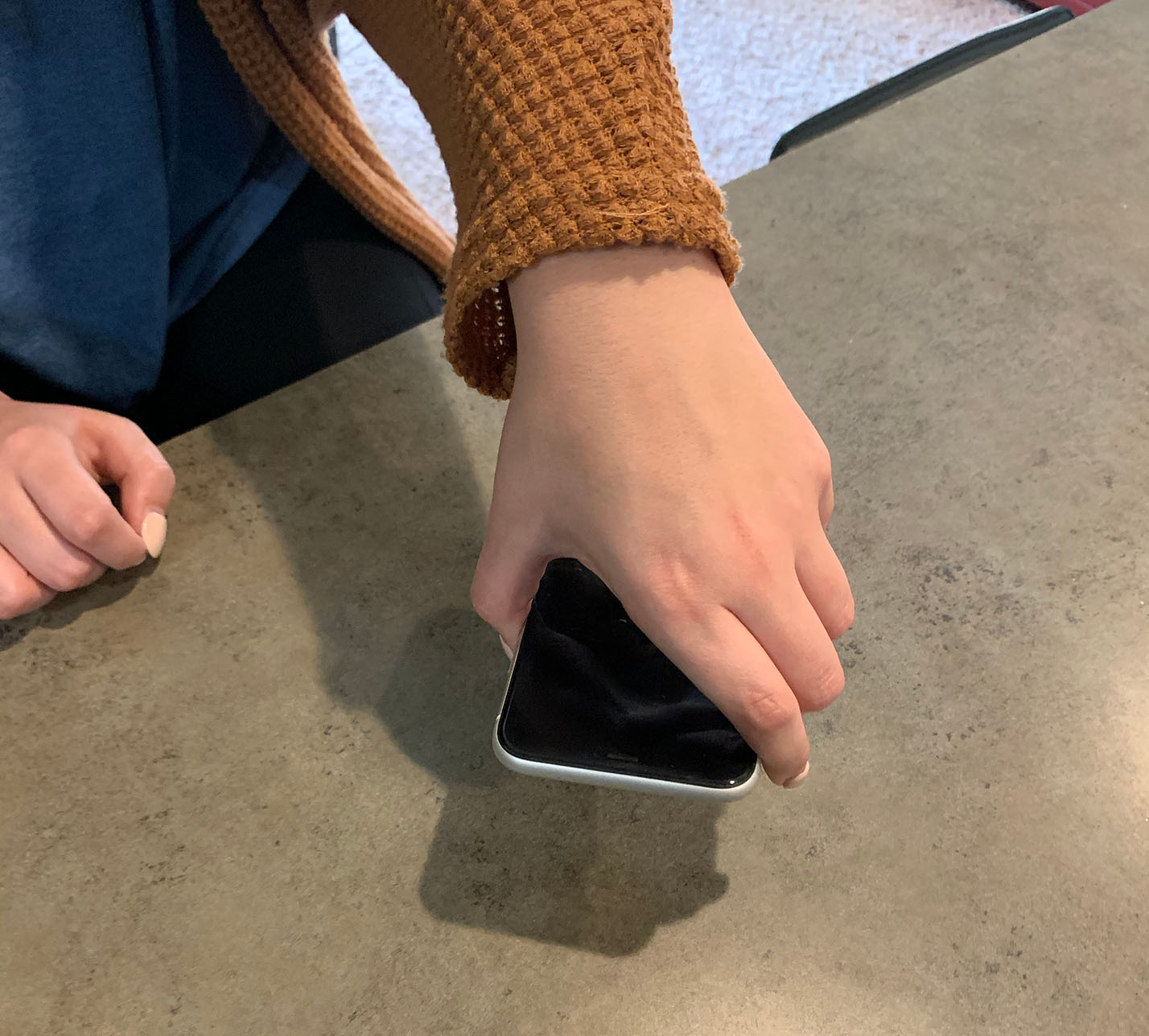
“I lost my boarding pass before because I put it in my carry-on bag and forgot about it... But with my phone its always in the same pocket.” – infrequent flyer
First, a sticker template will be digitally printed for better organization and branding. Next, these templates will have the traveler’s information thermally printed on top of the template sticker. Thermal printing is best here because it is cheaper, it creates better quality images, and it prints at lightning speed.

Paper stickers are generally thin and cheaper than vinyl stickers. However, vinyl is much more reliable and durable, making it the right fit for this job. Here's how the sticker templates would look before being thermally printed on.
Inexperienced flyers are prone to getting lost and not being prepared for each step in the boarding process. The objective of the re-design is to help non-frequent travelers successfully navigate through an airport by creating a mobile app that guides users through every step.
Through research and user interviews, I designed the app to provide a personalized step-by-step experience for each traveler.

Here are a few features the app would have. The main feature is the progress bar, which shows which step you’re on and what’s next. This should hopefully reduce anxiety for new flyers.

While auditing existing airline mobile apps, I found a common theme of readability problems emerging. Because of this, I made it a priority to use effective and careful typography.

Airport kiosks help users print their boarding pass if they prefer a physical ticket. These screens follow clear, user-friendly instructions to assist the passenger obtain their pass.

While waiting in line, you can view what to expect once its your turn, which will ultimately reduce stress in nervous flyers. Step three helps the user navigate to their gate, shows the passenger where they are in the airport and gives directions on how to get to their gate.

Other features help ease the boarding and baggage claim process, which I found are high-stress moments in the overall flying process.

Through user testing the app, I found what things were working and others that weren’t. The progress bar was a popular feature. The user liked being able to see what step they’re on, what’s next, and how many are left. The user also liked the detailed steps outlining what to expect when it’s your turn. Overall, the user liked the look and feel of the experience.


I found from user interviews that people with anxiety don’t like asking people for help in airports. They get nervous and would rather figure it out themselves. I asked if a live chat feature where you could speak to an airline representative over text message would help that. They liked the idea and said it would be helpful.

Lastly, I integrated a feature for viewing your personal health records from within the app. You would be able to upload your health records to view everything in one convenient spot.

Overall, my solution has several benefits: It reduces stress levels in travelers by preparing them with everything they need beforehand. It also gives them a step-by-step guide showing them where they are in the process. They are able to chat with an airline representative and ask questions, as well as view their health records all in one place.
Airports are already a stressful place. A more user-friendly, personalized boarding pass will give travelers a greater peace of mind and make flying a more enjoyable experience.
