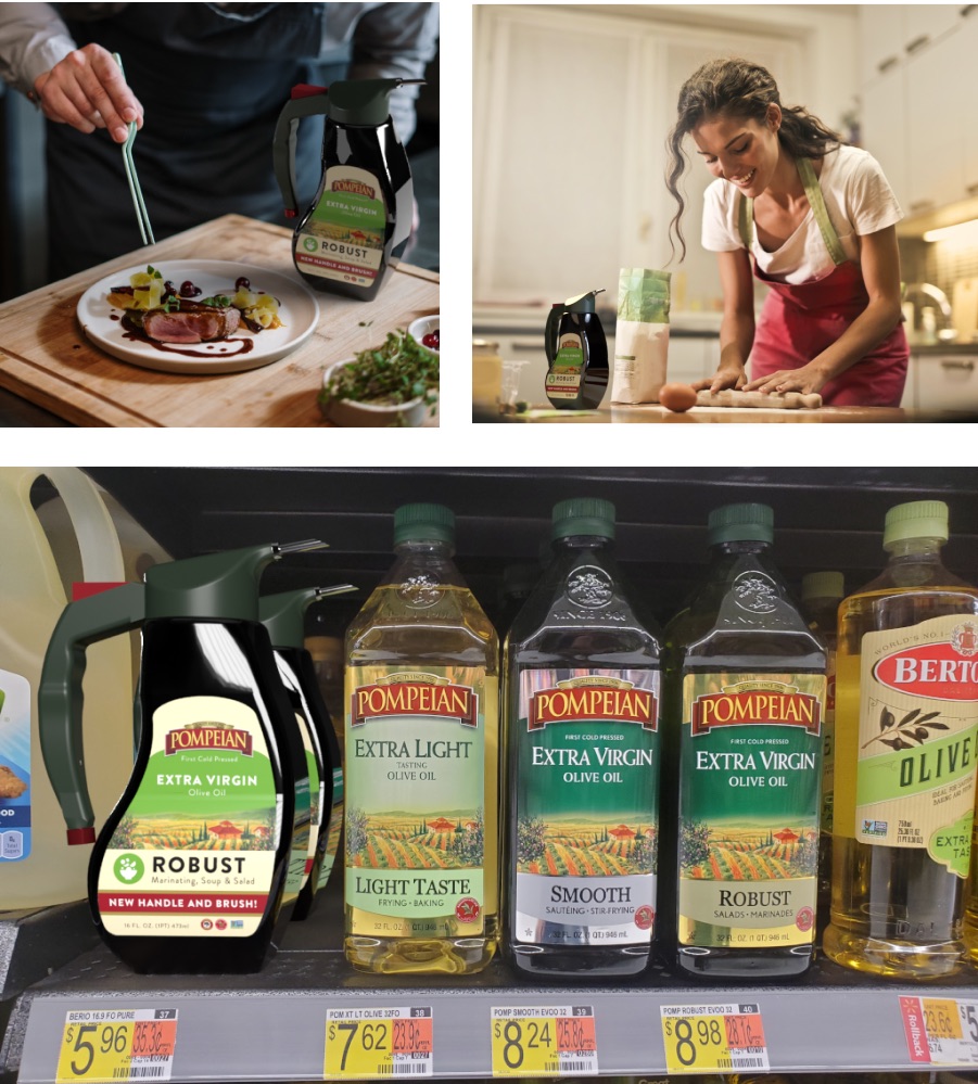
While there are many benefits of using olive oil, it isn’t necessarily the easiest product to use due to its packaging. Our goal was to create a more user-friendly package design by assessing the weak-points and finding ways to improve them.
| Date | Field |
|---|---|
| Fall 2020 | UX, Packaging design |
| Type | Client |
| Team project | Ferris State University project |
I helped research user types & products, had conversations with a Product Design student, sketched package ideas, and created a process book.
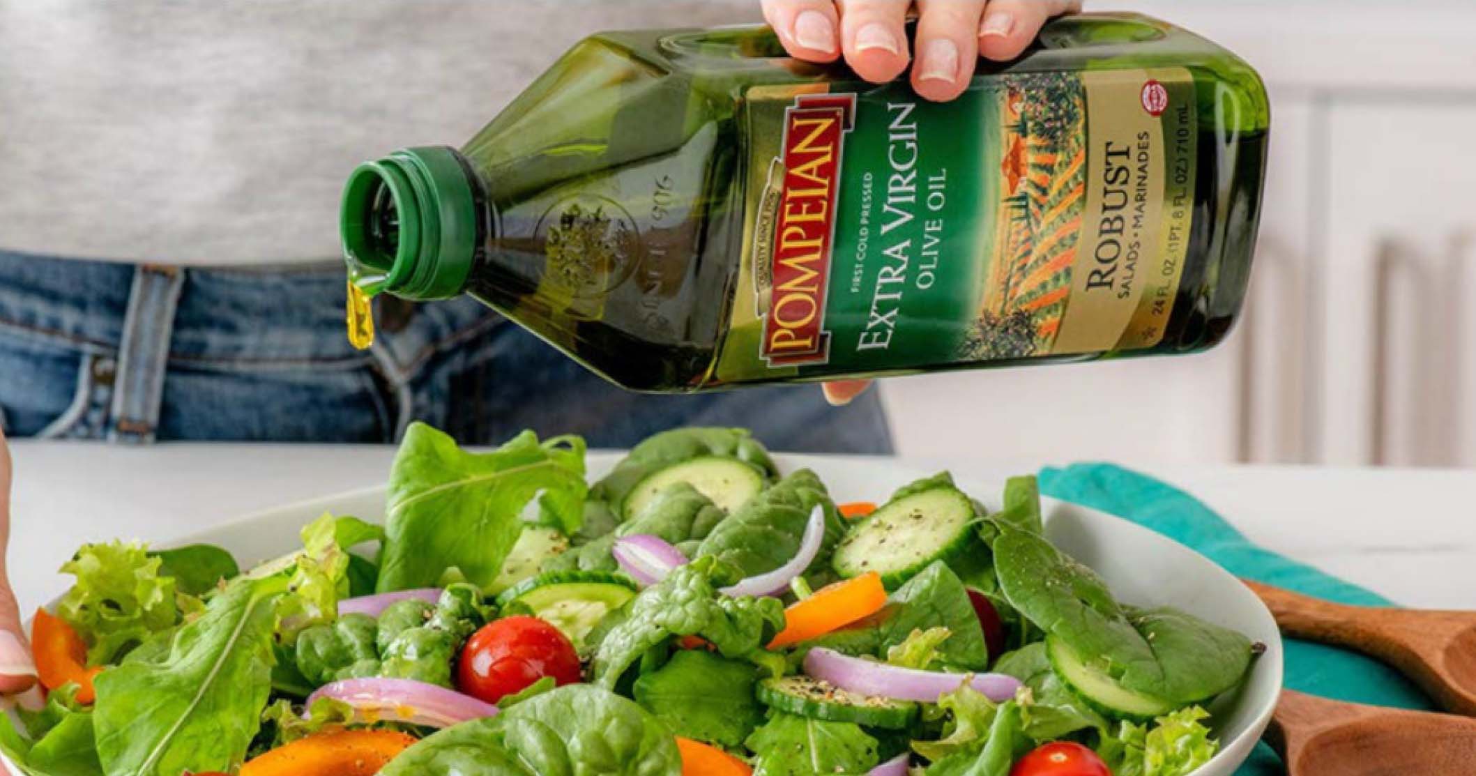
Most olive oil bottles look and behave very similar, meaning they all share the same problems. Whether it be usability, accessibility or accuracy issues, the current state has flaws that have become common in the design of these products. These problems guided our thinking in creating better package for an olive oil bottle.

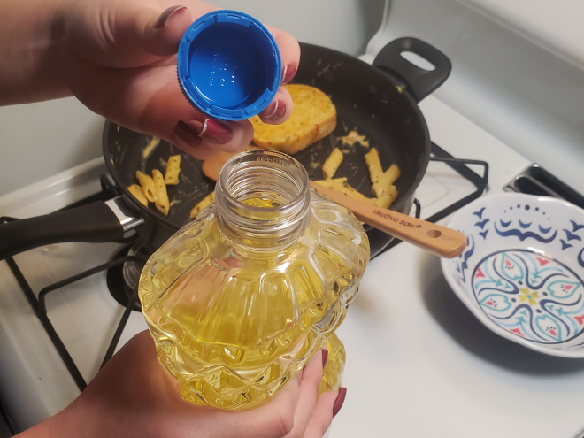

To provide the best cooking experience, our packaging will reduce the amount of dishes dirtied by completely removing the use of a separate utensil to spread the oil. The accidental moments of pouring too much oil will also be addressed and allow the user to have more control of the bottle.

Our first step was to explore best practices of other products. We found functions that work for different products and applied them to our solution. Using these ideas, here were some of my initial sketches:

We borrowed this idea from a feature of some water hose nozzles. The piece can turn to either select the brush or spout. When not in use, the cap has a third notch that stops olive oil from coming out at all.
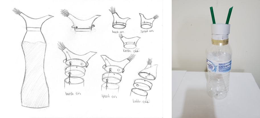
We found this solution resolves most of our problems listed. However, after discussions with our Product Design partner, he found a few problems, like sanitary issues and high manufacturing costs.
We took the advice from our Product Design partner and user feedback to develop a new prototype. This model has a handle for easy handling and usability, a spout for accurate pouring, and a brush attachment for brushing function.
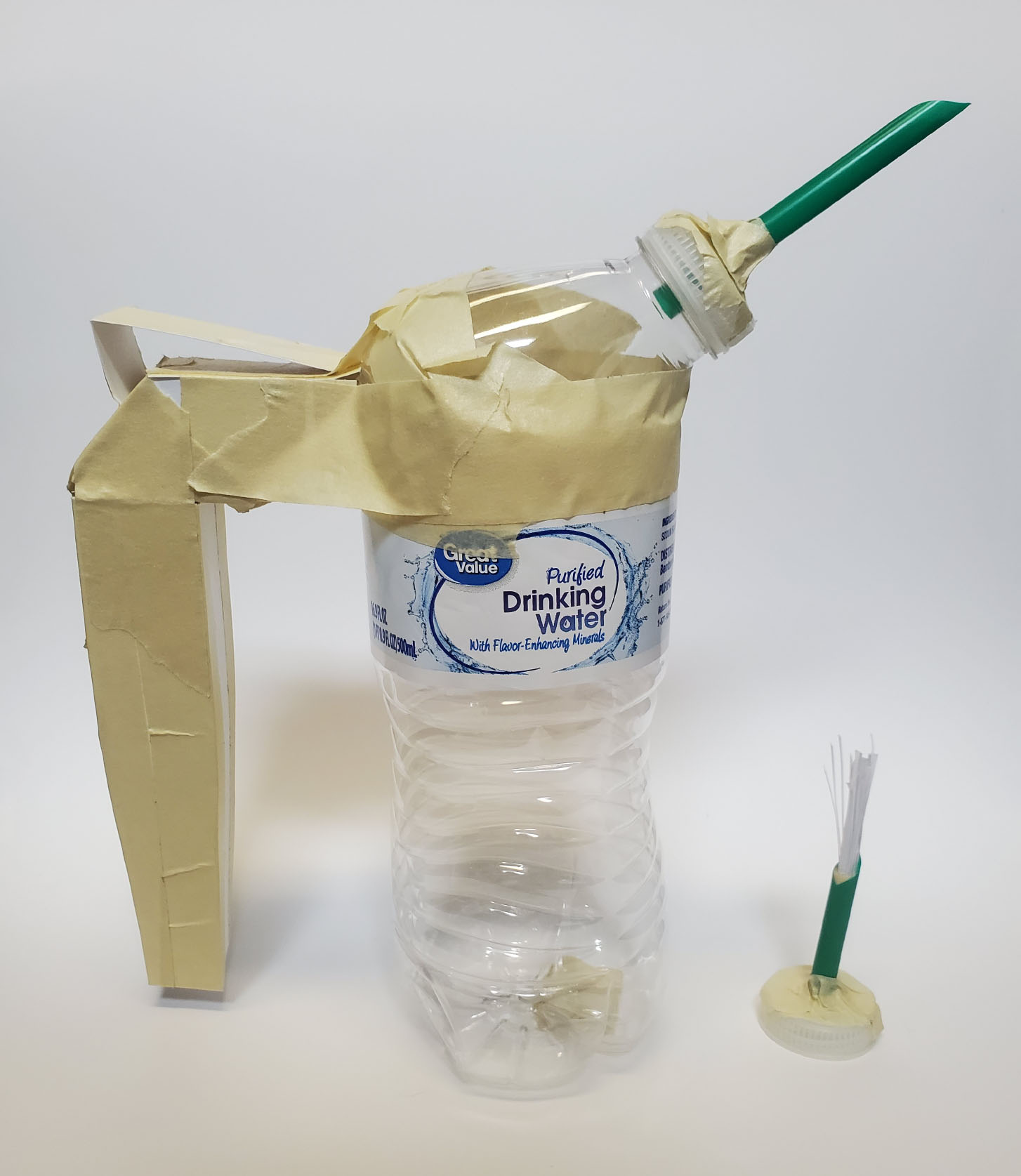
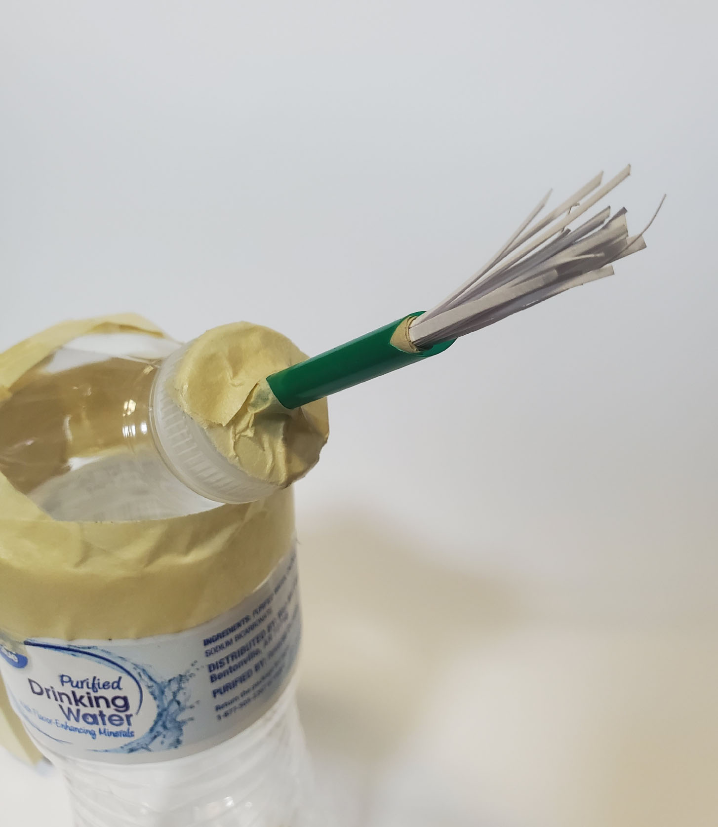
Storage was always a problem for olive oil bottles. We found that creating smaller bottles could solve this problem. Also, if the bottle is small enough to keep on the counter, than appearance is a concern. The bottle must look appealing and attractive while sitting on a kitchen countertop.
We took the feedback we got in the first two rounds to develop this final model. We made modifications like shortening the handle to allow for better handling. Also, we added a function to put the brush attachment into the handle for storage when not in use.
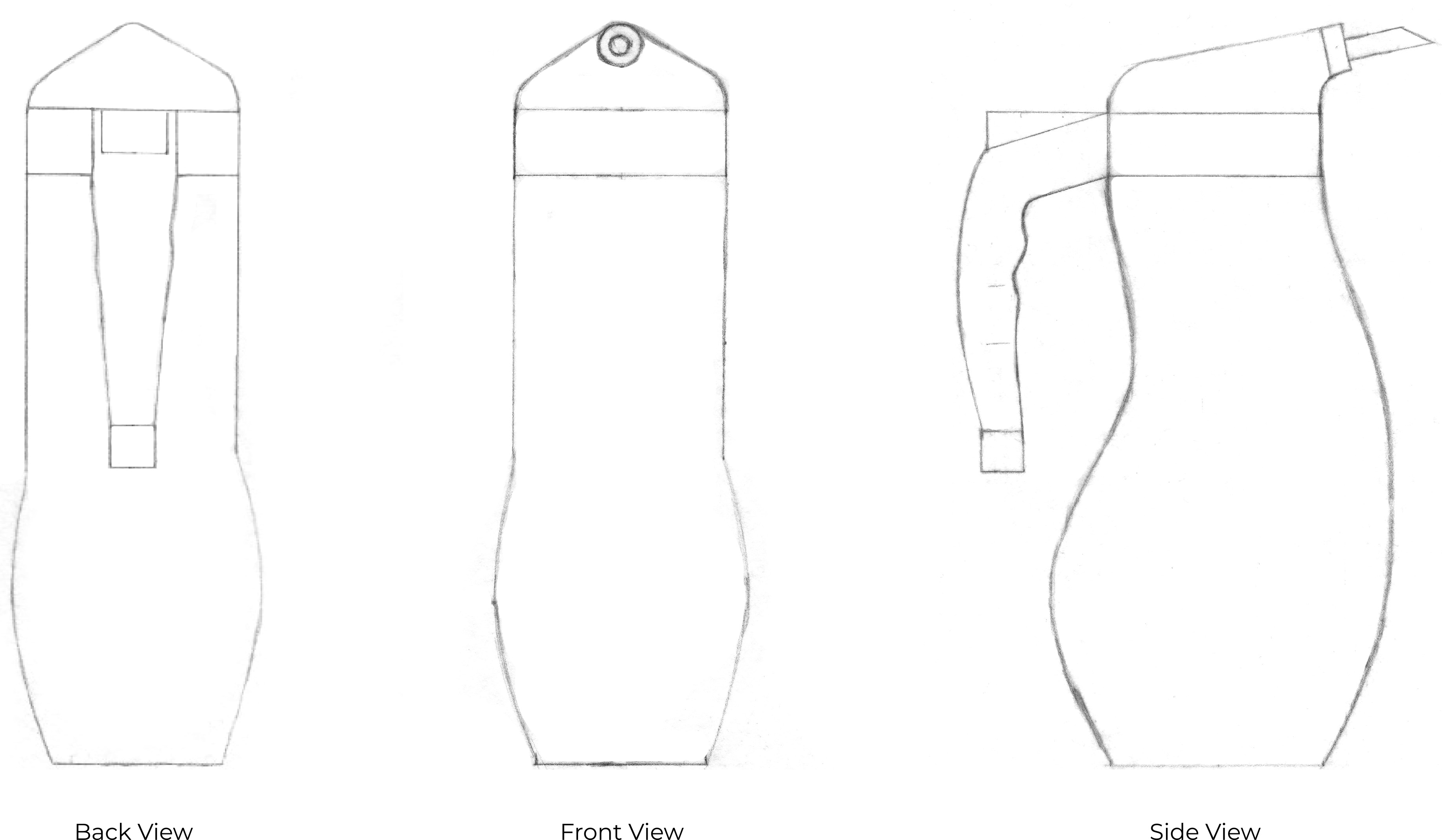
After a lot of discussion with out Product Design partner, he developed this model. We added a green shade to the bottle because it protects the olive oil from the natural light that will make it deteriorate faster. We also decided on a stronger plastic for the material, which won't break down and leave any residue inside.

The brush attaches over the spout without removing any pieces to reduce dirtied utensils and allow for easy cleaning of the brush. The button release assists in controlled pouring and reduces contamination of the oil. Lastly, the brush attachment is stored in the handle for easy access and aids in cleanliness.
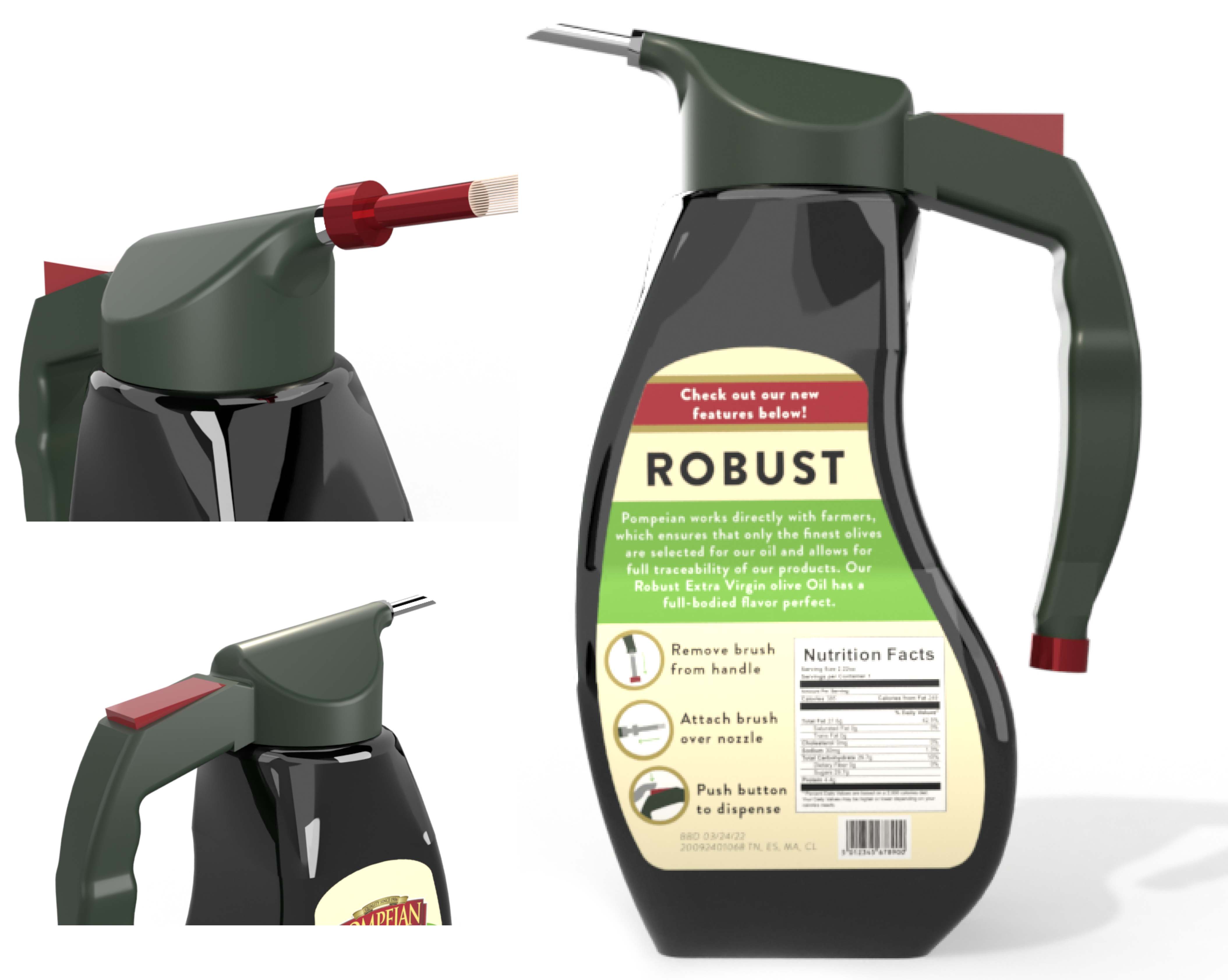
We designed the label to look like their brand's qualities, while also keeping similar aspects of their current package design. We also added text showing that this bottle has new features. Another thing that is unique about our bottle is the shape. The bottle itself, the handle and spout make our package stand out among the others. It will surely attract the eye of a consumer walking by.
