
Founded in 2014, UV Angel is an infection control technology company located in Grand Haven, MI. This up-and-coming group extends their brand through a variety of channels, including digital, print, video, and exhibit design.
| Date | Field |
|---|---|
| Spring 2022 – Present | Graphic Design, Branding, UI/UX Design |
| Type | Industry |
| In-House Design | Infection Control Technology |
For over two years, this position has challenged me with extending our brand identity across print, digital and exhibit spaces. Being part of a smaller team within a startup, I took the initiative to learn new skills, such as video editing and large-scale trade show design. The project highlighted below is only a segment of the wide variety of design challenges I've faced in this role.
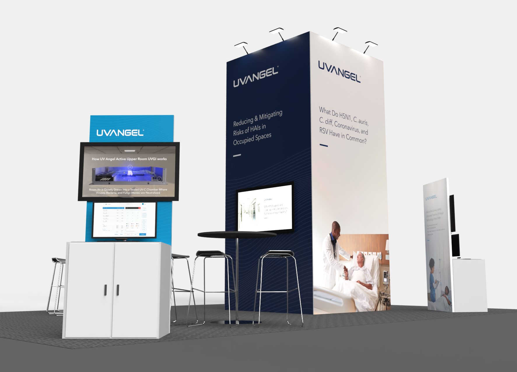
The Association for Professionals in Infection Control and Epidemiology (APIC) hosts an annual conference & exposition to showcase the latest science, research, and technology in the Infection Prevention (IP) field. UV Angel is a regular exhibitor with the goal of building brand recognition and generating leads.
In preparation for the event, we created materials focusing on targeting three main user groups: hospital administrators, infection preventionists, and healthcare facility managers.


Our floorplan for the booth featured plenty of space for messaging and visuals. The layout below was our original layout arrangement. However, with the advice of our Sales team, we re-structured some items to create a more open space.
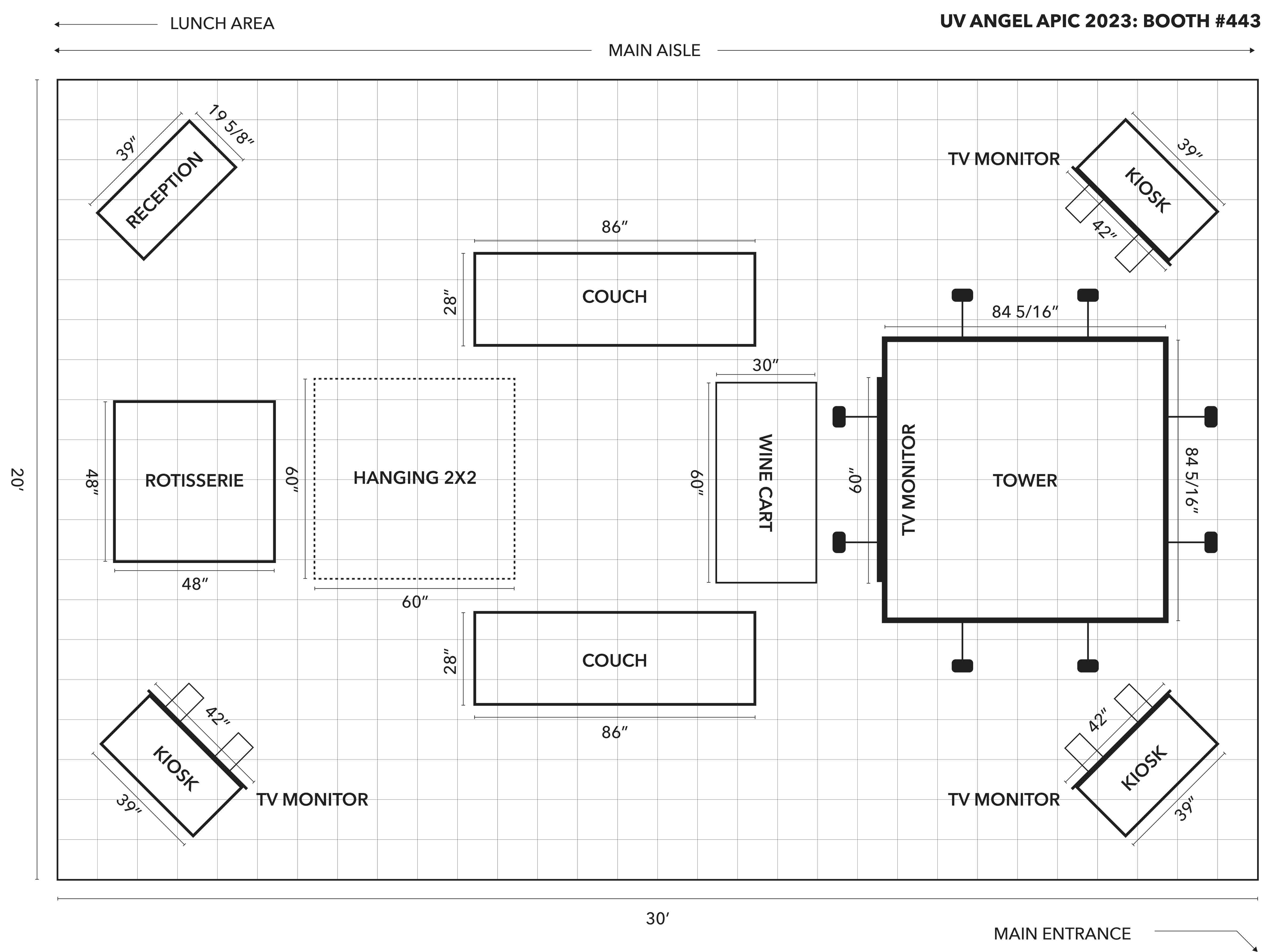
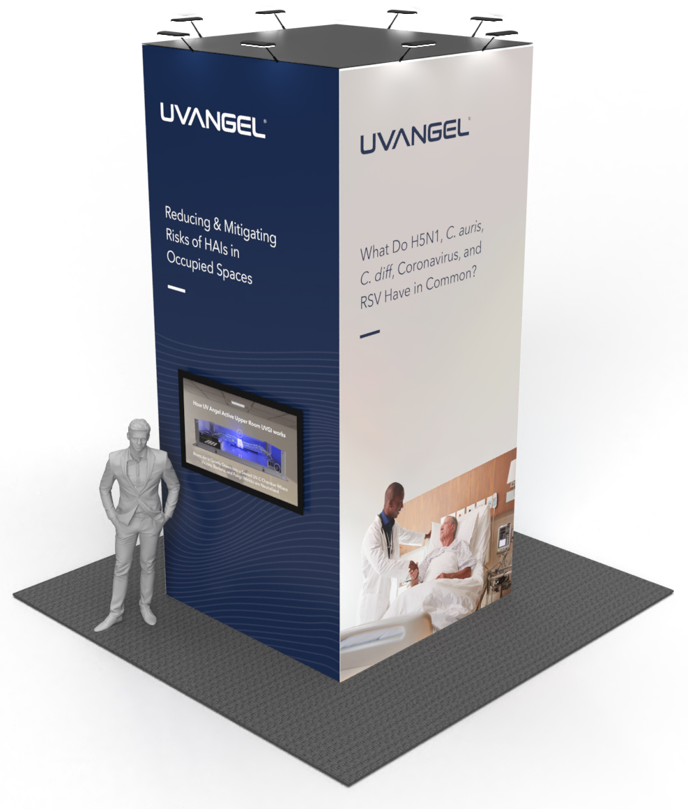
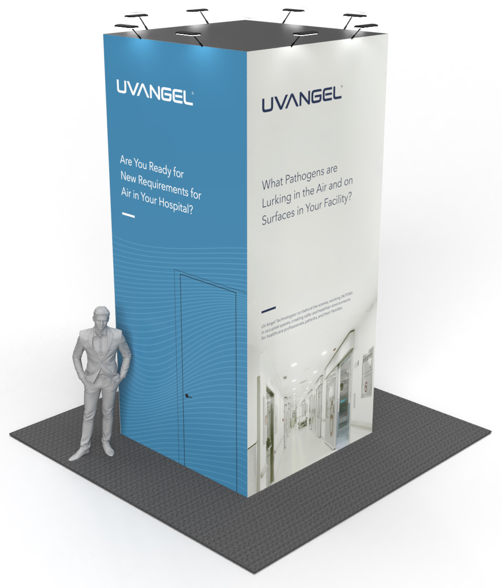
The booth allowed for messaging and branding on the 7ft. wide by 15ft. tall tower, as well as kiosks with products, demos, and videos.
The tower is the focal point of the booth. Its purpose is to intrigue show attendees, generate curiosity, and bring people into the booth. I utilized brand elements, imagery, and typography to achieve this goal.
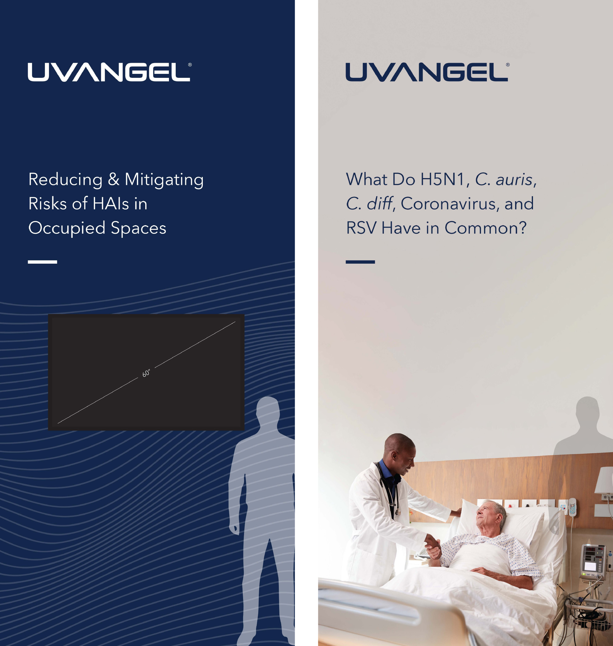
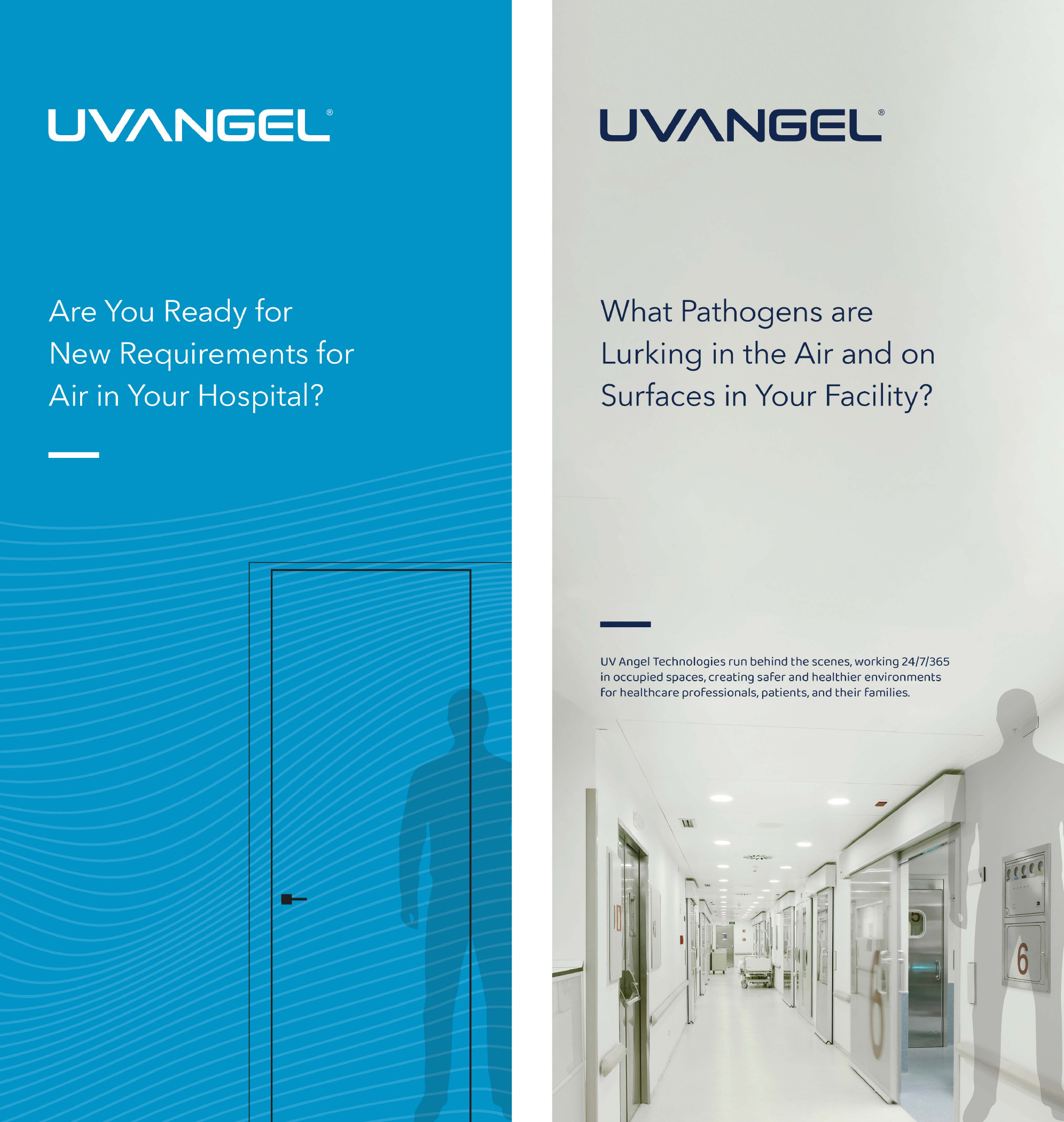
I used a variety of design components, including patterns and extended photography to generate visual interest. While these designs are fairly conservative, the Marketing team felt they reflected the topics being discussed well.
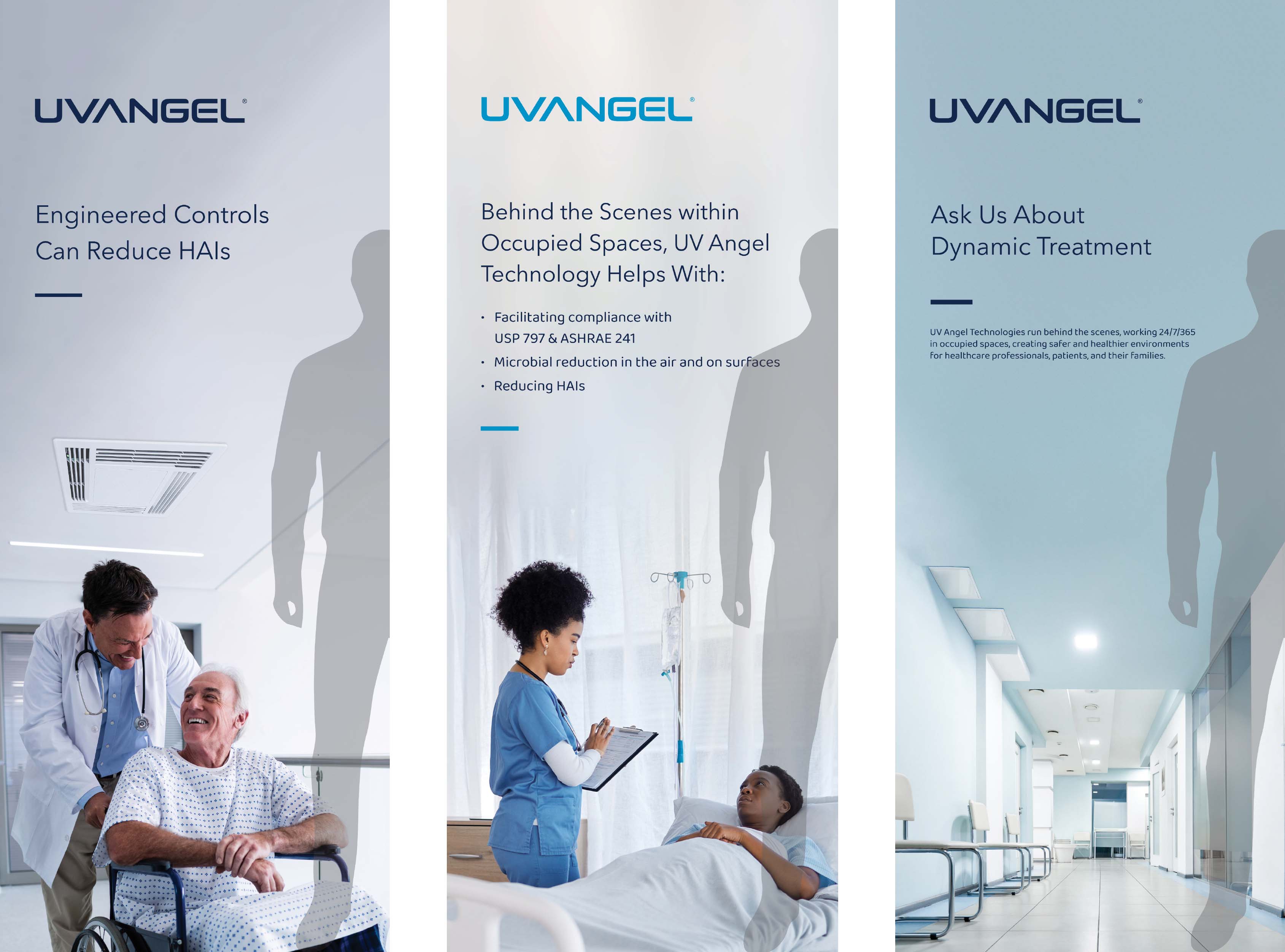
Similar to the booth tower, these kiosks provided terrific real estate for designs to attract and inform individuals walking through the aisles of the convention center.
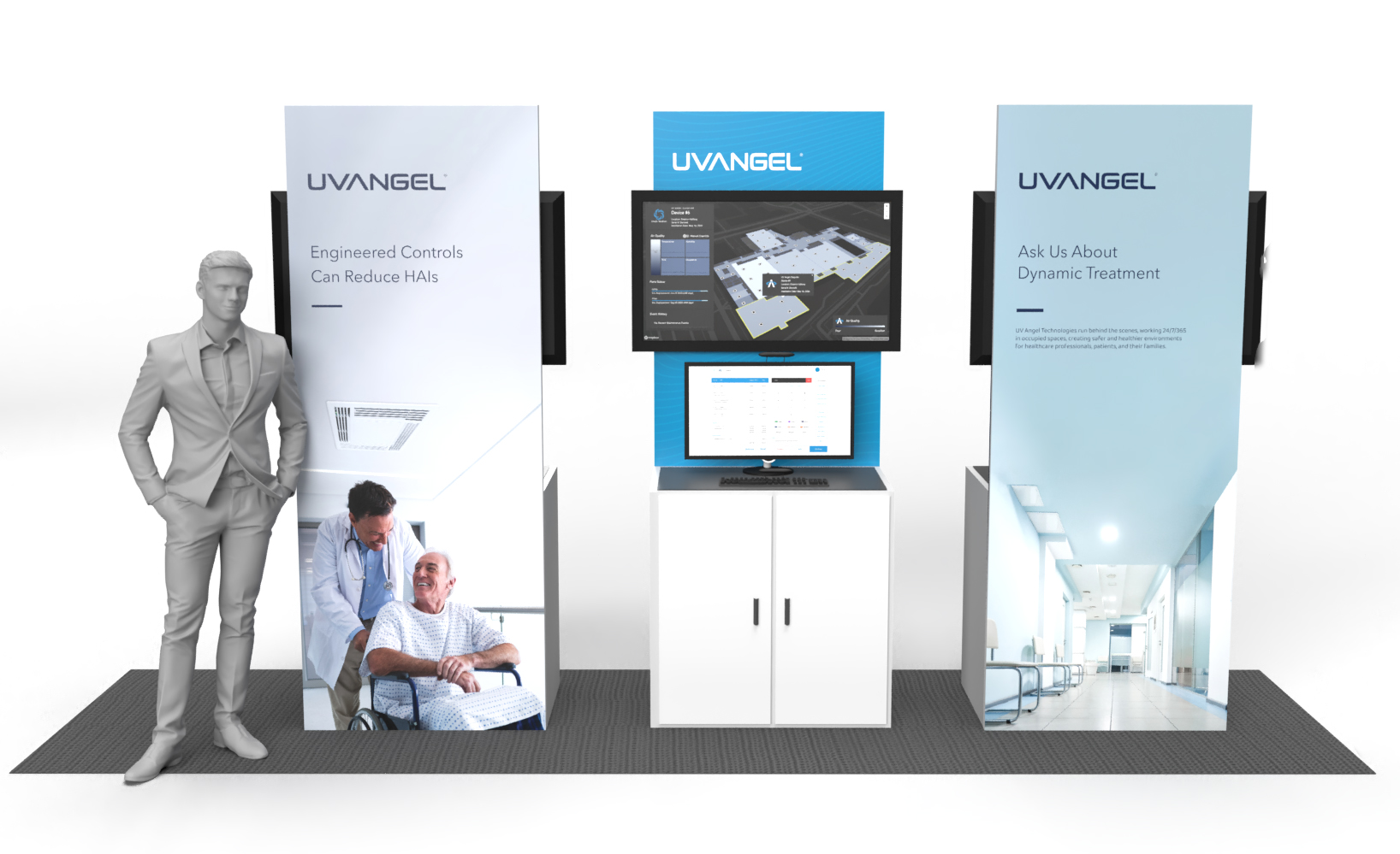
After some changes to the booth layout, including bringing in tables and stools for quick exchanges, these were the final renderings for our exhibit space.
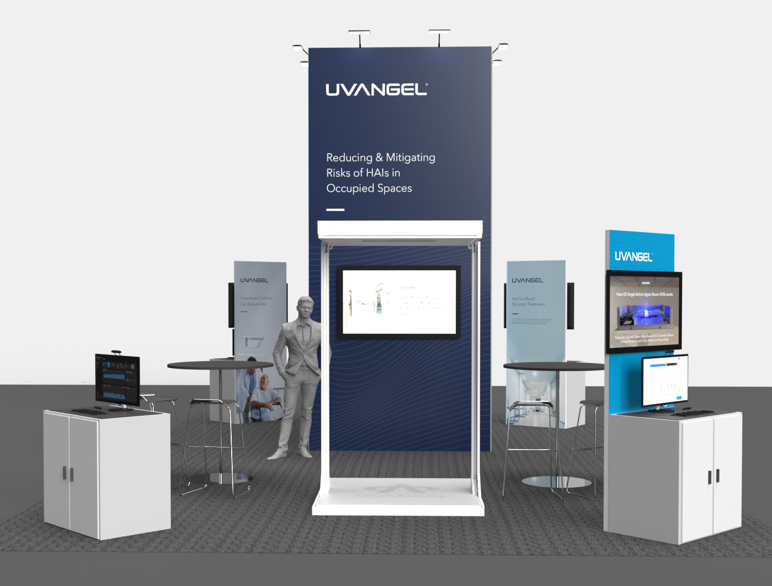
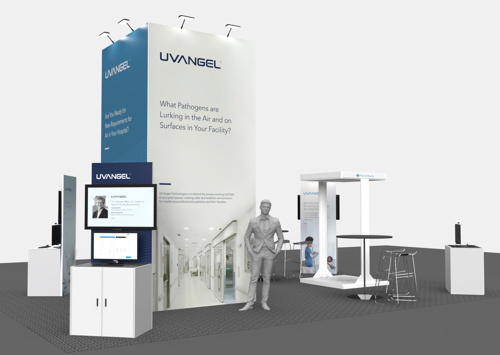
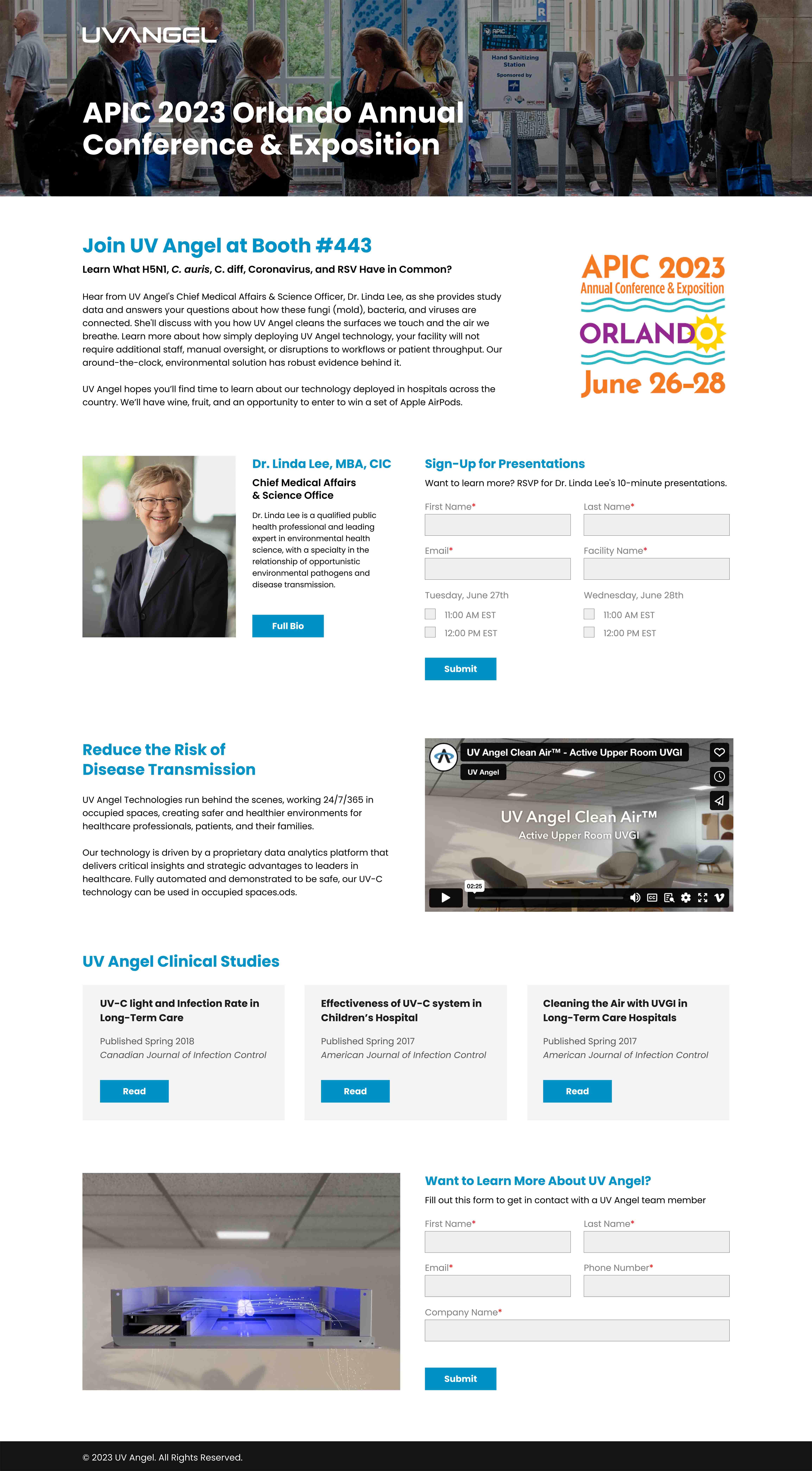
Along with the physical space, we had a variety of digital touch points for the show, such as a HubSpot landing page, an E-mail campaign, and product videos.
The goal of the landing page was to collect leads, register attendees for short presentations, and provide viewers with additional reading material. At the show, we used branded QR codes to direct attendees to this page for further learning.
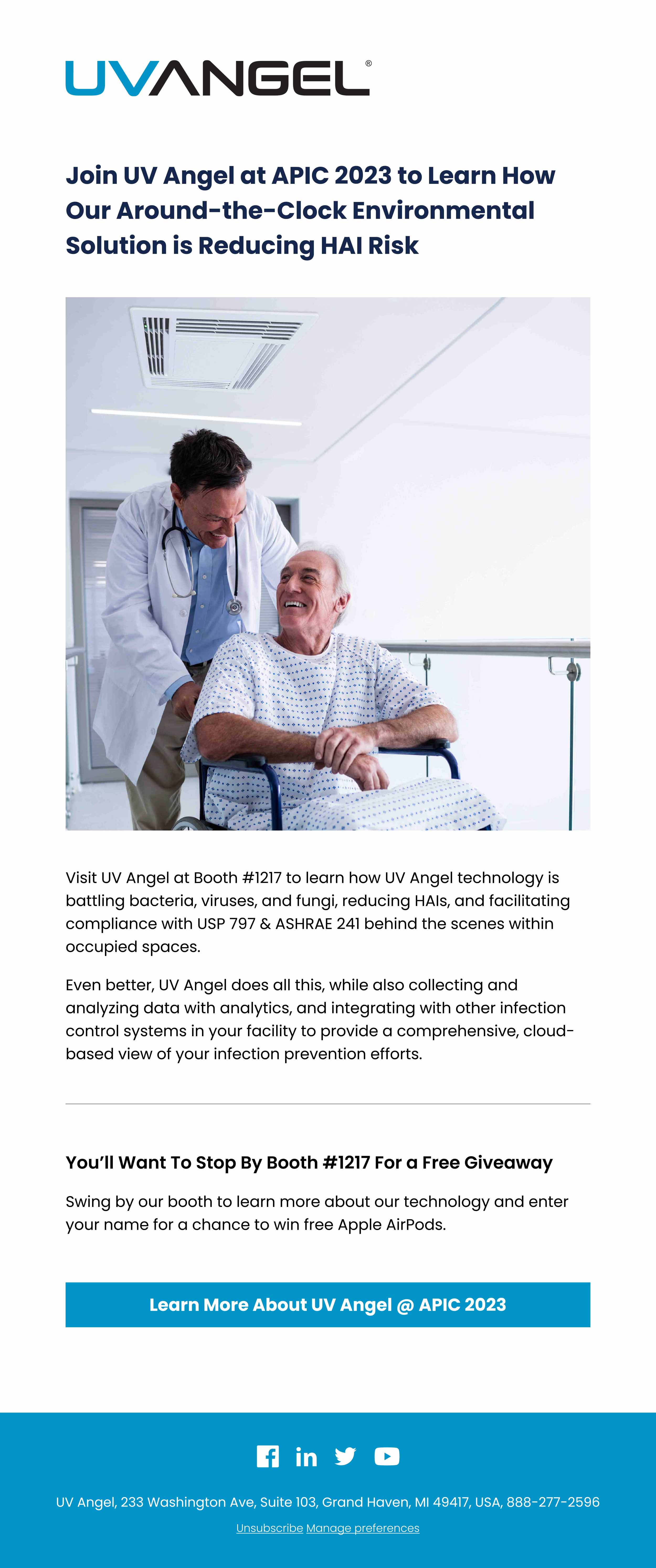
We sent our multiple pre-show emails, as well as several follow-ups to leads and attendees.

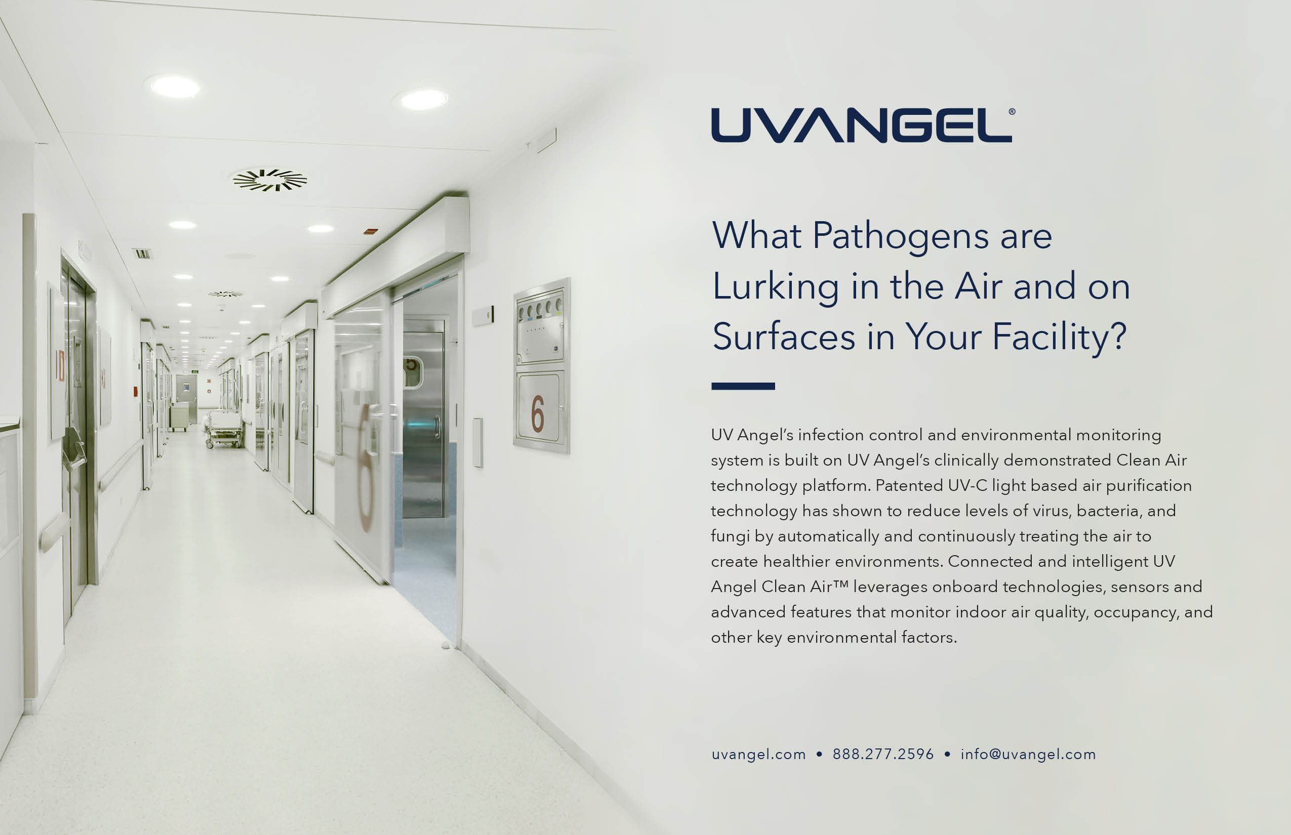
The Sales team distributed these postcard-sized handouts, which gave attendees a quick overview of our technology and purpose.

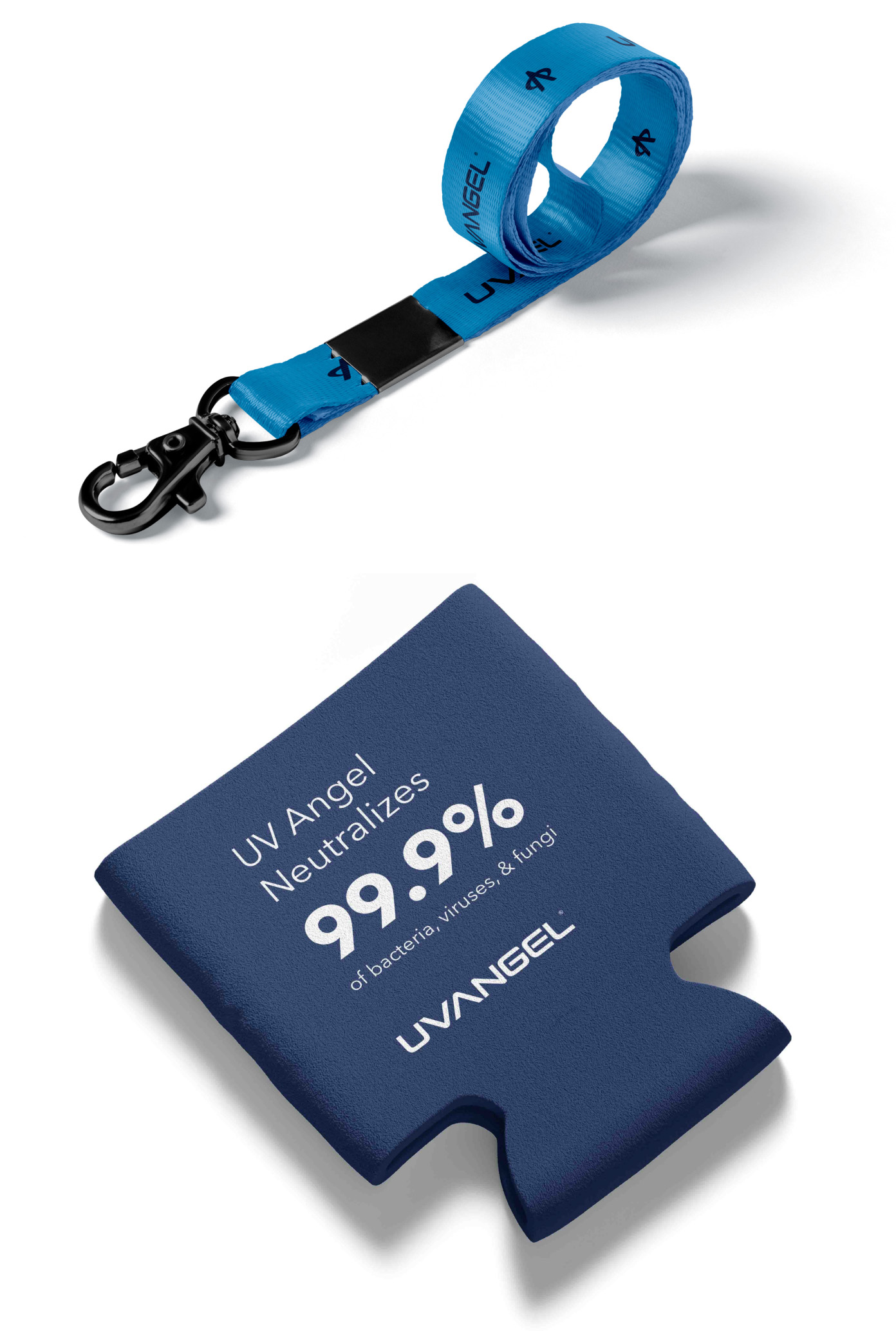
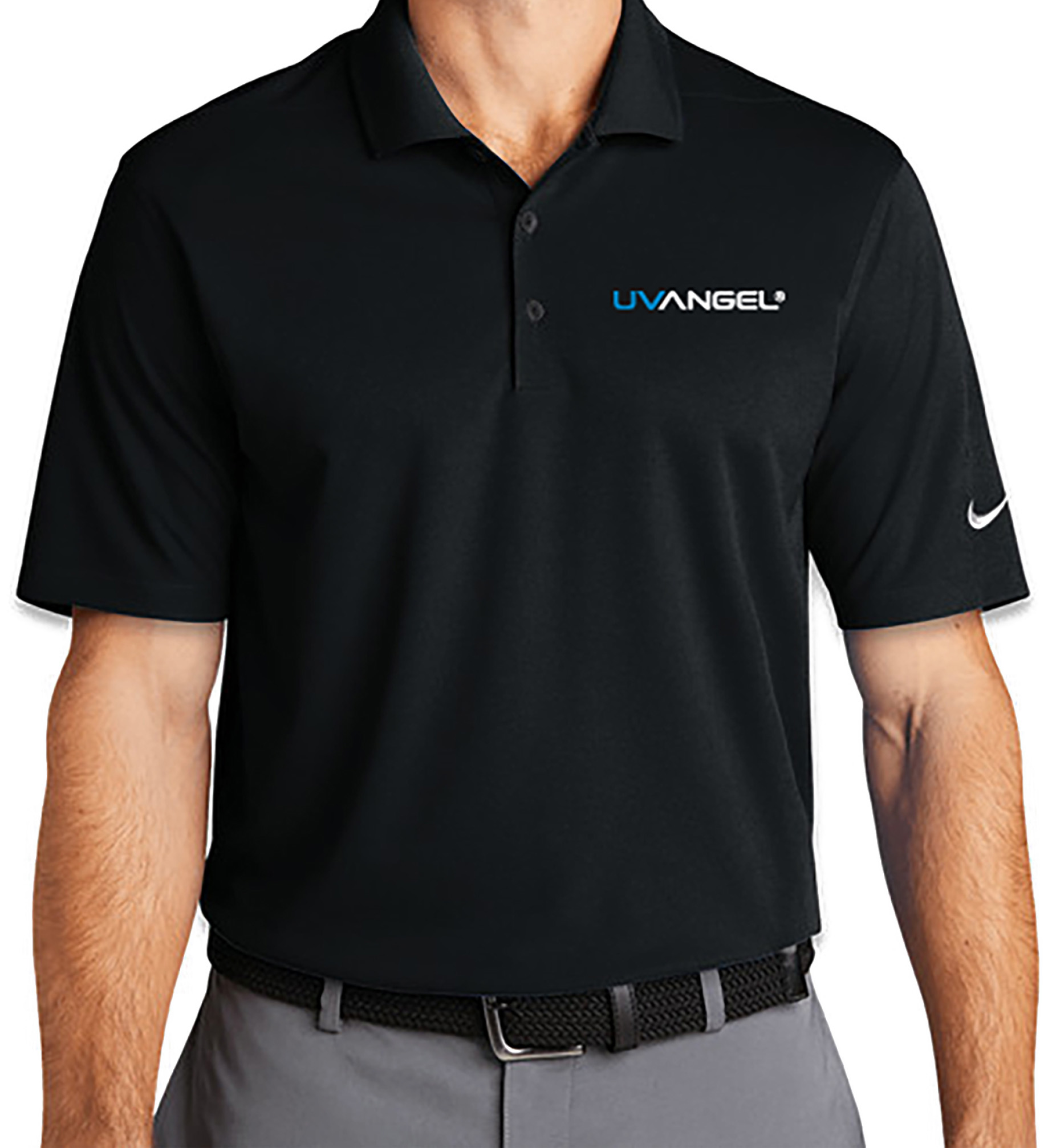
UV Angel branded lanyards, koozies and polo shirts were used at the show to continue reinforcing our brand recognition.
In the end, our team at the show reported the conference was a great success. We ultimately gathered 213 new leads, which has already led to a number of conversations and conversions of sales.
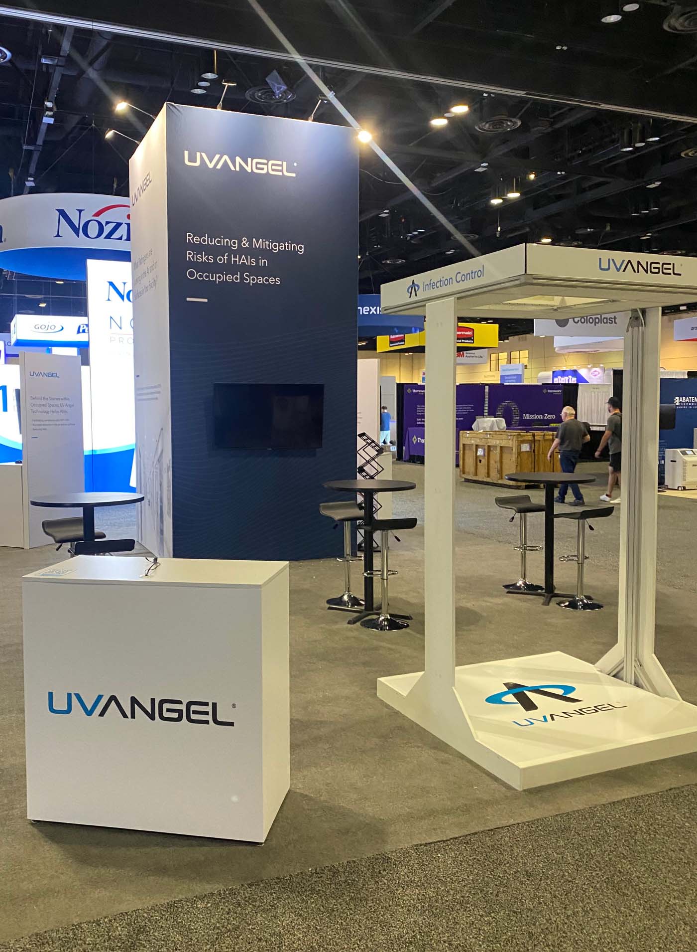
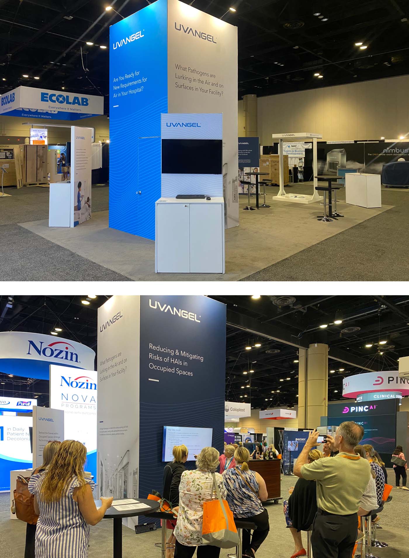
At times, the booth had a few dozen people gathered around to listen to presentations and speak with our Sales team. The balance of careful planning, tactful messaging, and efficient design combined for an excellent opportunity to reach a wide audience.